
Summer to Autumn Wedding Stationery Ideas and Palettes
Summer to autumn weddings: how to refresh your stationery palette and on-the-day details
Late summer slipping into early autumn is a beautiful window for UK weddings. Light still lingers, hedgerows brim with colour, and the first bronze leaves begin to appear. It is also the perfect moment to evolve your stationery story so it feels seasonal, elegant, and cohesive from invitation to final thank you.
This guide shares colour palettes, motif ideas, practical sequencing, and format advice to help you refresh your suite with confidence. It also answers common questions about colours, must-have items, budgets, and favours guests actually use.
Easing a summer palette into autumn
If your invitations lean summery, you do not need to start again. A few graceful shifts will carry your look into September and October while keeping everything coordinated.
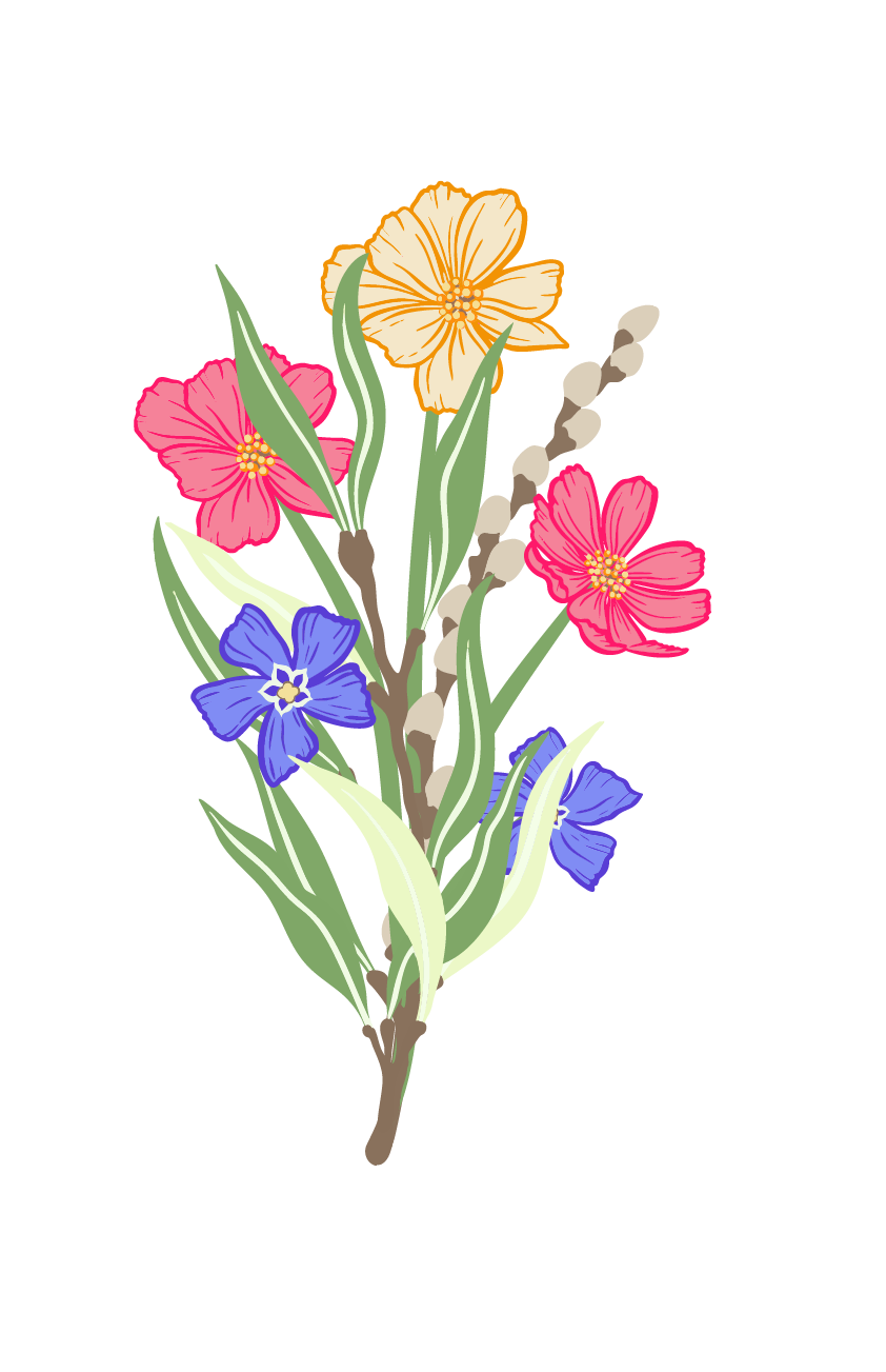
- Wildflower to meadow-rich: keep bright cornflower blues and buttercup yellows, then thread in deeper marigold, burgundy, and blackberry accents. A wildflower wedding invitation can evolve into rich wildflower wedding stationery for on-the-day pieces with slightly darker tones.
- Greenery to woodland: eucalyptus and gypsophila feel fresh in August; introduce moss, fern, and muted sage for September. If you began with a greenery wedding invitation, carry the foliage into menus and table names with a woodland note.
- Blush to vintage floral: blush roses pair beautifully with antique gold, warm taupe, and aubergine. Vintage floral details signal autumn without losing romance.
- Add one grounding neutral: ivory or soft mushroom card stock stabilises bolder blooms and keeps typography legible in candlelight.
Requesting printed samples helps you compare weight, colour, and print effects in person before you commit. If you would like to see a favourite motif in a deeper palette, ask about semi-bespoke colour adjustments.
Choosing formats that showcase seasonal art
Different formats hold illustration and information in distinct ways.
- Concertina: brilliant for late-summer couples who want a single piece that guides guests from ceremony to dancing. Extra panels can host travel notes, a gentle wedding timeline, or a venue sketch.
- Gatefold: neat and elegant for couples who prefer three clear panels, often used for the formal invite, guest information, and an RSVP route.
- A5 flat: a timeless, streamlined canvas for bold florals or a venue painting, perfect when details are minimal and artwork leads.
Whichever you choose, keep typography and artwork consistent across your suite, including evening invitations, menus, table names, signage, and thank you cards. A consistent serif or modern serif for headings and a single body font creates polish.
Motifs that bridge the seasons
- Wildflowers: meadow compositions shift easily with deeper reds, rust, and inky greens.
- Eucalyptus and gypsophila: layer in berries, acorns, or seed heads for subtle autumn texture.
- Woodland botanicals: ferns, oak leaves, and bracken sit beautifully beside late blooms.
- Vintage florals: painterly roses and dahlias in warm colourways feel autumnal yet classic.
- Venue illustration: a bespoke wedding venue painting adds keepsake value and anchors the whole narrative across place cards, menus, and signage.
If you are curious about bespoke adjustments, a semi-bespoke approach keeps timelines efficient while allowing tailored colourways or a custom illustration.
Your practical timeline, step by step
- Finalise guest list and gather RSVPs. Choose one RSVP method, such as a small postcard or a QR code, and set a single clear deadline.
- Confirm seating and menu choices.
- Order on-the-day stationery: menus, flower table names, place cards, welcome sign, order-of-the-day, and the table plan.
- Add favours and tags last, once counts are firm. Seed packet wedding favours are popular, practical, and easy to personalise.
For a smooth finish, align typefaces and artwork across formats so a concertina invitation, a gatefold evening invite, and an A5 menu all feel like part of one suite.
Paper, print, and finishing details
Luxury card and careful hand-finishing elevate seasonal artwork and help colours read true in natural or candlelit settings. Consider envelope upgrades or liners for a subtle nod to autumn, such as deep berry or warm kraft. If you love illustration, a wedding venue illustration can sit on the reverse of your menu or at the foot of your table plan for a discreet, keepsake touch.
Smart ways to save without losing style
- Keep the invitation suite focused: main invitation plus a QR code to a webpage for finer details typically costs less than multiple inserts.
- Use one RSVP route and one date to simplify printing and reduce extras.
- Consolidate artwork: reuse your floral or venue motif across pieces to avoid multiple new commissions.
- Order accurately: confirm numbers after RSVPs to limit waste.
- Pick a versatile format: a concertina can carry all details in one print run.
Popular favours guests actually use
Seed packets are consistently well received. Guests enjoy planting them, and they echo seasonal florals beautifully. Other practical choices include mini preserves, artisan chocolates, or personalised tags on bottles that can double as place settings. Keep packaging cohesive with your palette and add a small thank-you line to each label.
Quick answers to common questions
-
Which colours are best for wedding invitations in late summer to early autumn?
Think warm-meets-fresh. Pair sage, eucalyptus, and blush with marigold, rust, blackberry, and antique gold. If your venue is rustic, lean into fern and oak; for classic settings, try vintage florals in deep rose and aubergine. -
What stationery is needed for a wedding?
Core items usually include invitations and evening invitations, order of service or programme, place cards, menus, flower table names, a welcome sign, and a table plan. Thank you cards close the loop after the day.
-
How can you save money on wedding stationery?
Limit inserts, choose one RSVP route, reuse artwork across the suite, and order only after RSVPs are in. A single-format approach often helps.
-
What are the most popular wedding favours?
Seed packets, small edible treats, and bottle labels or tags that double as place markers.
-
What favours do people actually use?
Anything consumable or plantable, especially wildflower seed packets and quality chocolates or preserves. - Gentle next steps
- Request printed samples to compare weight, colour, and print effects, and to see how late-summer and autumn palettes translate to luxury card.
- Enquire about semi-bespoke colour shifts or a bespoke design service if you would like a venue painting woven through your suite.
Explore seasonal suites and formats, or get in touch for guidance on palettes, typography, and artwork alignment. For inspiration and tailored support, you can browse wedding stationery invitations, consider a concertina wedding invitation for an all-in-one format, or enquire about a bespoke wedding stationery commission that includes a wedding venue painting.
Internal links to help you get started:
- Browse refined designs and formats: wedding stationery invitations at https://paperwillow.com/collections/wedding-invitations
- See an all-in-one layout: concertina wedding invitation at https://paperwillow.com/products/wildflower-wedding-concertina-invitation
- Add a keepsake touch: bespoke wedding stationery and venue paintings at https://paperwillow.com/pages/bespoke-design
-
Close the loop beautifully: wedding thank you cards at https://paperwillow.com/collections/thank-you-cards
A cohesive, season-aware stationery plan will carry your celebration from invitation to last dance with quiet elegance. If you would like suggestions tailored to your venue or palette, the studio would be delighted to help.